Statistical Analysis:
A Study of Sample Size
If you told me six months ago that I would
be here on the web arguing the merits of statistical analysis
to prove or disprove a theory I would have laughed out loud at
you. However, about 3 months ago I began training where I work
to become skilled in the art of studying variance. As some may
be aware, Motorola started a program back in the early 1980s to
study variances in manufacturing processes, and make predictions
based on that study. Their in house effort has bloomed in the
last 20 years to a very robust program called "Six Sigma".
Six Sigma is a very rigorous program by
which a process is studied by gathering data representative of
the process and analyzing it to see what it tells you. Once you
analyze it, you draw conclusions and can even make predictions
about future behavior. It is not my attempt on this page to provide
an in depth education on statistical analysis, but rather to look
at Eric von Sneidern's study of Disston blade composition and
hardness, and to see if the conclusion that is drawn is supported
by the data.
Eric's study which you can read here
looks at five different handsaws, each a different model in the
Disston line, and analyzes the steel composition and blade hardness
for each saw. The study attempts to confirm or deny that there
is a real difference in the steel comprising the various handsaw
models. Some believe that the differences are merely a marketing
tactic to increase sales in one way or another and that no real
difference exists.
I heartily commend Eric for the time and
effort he spent in conducting the analysis. It is a first of a
kind work in this area. I first speculated in the Summer of 1998
in an article
that I wrote for the Fine Tool Journal about the relative grades
of steel and that a thorough analysis would need to be done to
substantiate the Disston claim that one hand saw was better than
another based on the steel used.
Unfortunately, the conclusion that Eric
draws in his study that the steel types aren't different simply
can't be supported by the data that he provides. Further, the way the study was conducted is flawed
in several ways, first with respect to the sample size
that was used for the study, and second that different vintages
of saws were used in the study. In the text and graphs that
follow, I will explain how I came to this conclusion. Hold on,
the ride is about to get bumpy.
Normal Distributions
The study of manufacturing outputs has been
going on for many years. In any process, there is a distribution
of values that comprise any population. For instance, for the
sake of this example, lets say that Disston could make 1000 D12
handsaws a week. Each week they mixed up and used a different
melt of steel. Further, once the steel was rolled and punch, the
steel was tempered in batches of 50 in an oven. Let's say that
they did this every week for a year. At the end of the year, they
would have made about 50,000 saws. That population would be comprised
of 50 different melts of steel, and 1000 different tempering batches.
Then, let's say that all the saws were sold to the public. And
Disston repeated this every year for 20 years. Now, let's say
that you went across the country and bought 1000 of the 1,000,000
handsaws and tested each one to determine the range of hardness
in the population. Naturally, in any process there is variation.
We want to know how much. A graph of that distribution might look
like the chart below:
 For all the graphs
in this treatise, I used version 13.0 of Minitab, a statistical
analysis tool which can generate random samples of data. I created
two sets of populations. One was for D12 saws and one for D8.
I told the random sample generator to make random samples for
each saw type with populations of 3, 10 and 1000. For each population,
the standard deviation was 1.0. For the D12 samples, the average,
or the mean, was set to 55. For the D8 samples, the mean was set
to 53. I reasoned that if I was Disston, those would be good values
to have corresponding to the relative quality of the saw and would
represent hardnesses on the Rockwell C Scale of 53 and 55.
For all the graphs
in this treatise, I used version 13.0 of Minitab, a statistical
analysis tool which can generate random samples of data. I created
two sets of populations. One was for D12 saws and one for D8.
I told the random sample generator to make random samples for
each saw type with populations of 3, 10 and 1000. For each population,
the standard deviation was 1.0. For the D12 samples, the average,
or the mean, was set to 55. For the D8 samples, the mean was set
to 53. I reasoned that if I was Disston, those would be good values
to have corresponding to the relative quality of the saw and would
represent hardnesses on the Rockwell C Scale of 53 and 55.
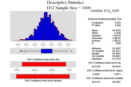
In the example at the right, we can see
that the data is normally distributed. A normal distribution is
often characterized by a bell shaped curve. The graph at the right
is called a histogram. As we can see from the descriptive statistics,
the mean is calculated at 54.9965 and the standard deviation is
1.0108. They are not exactly 55 and 1 because of the random number
generator that Minitab used to generate the sample. There are
two other important numbers on this graph.
One is P which we can see is .450. In statistics,
there is what is known as the null hypothesis. The null hypothesis
says (depending on what test you are looking at) that unless you
can prove otherwise, there is no difference between two measurements.
The alternate hypothesis says that there is a difference. P is
a measure of how confident you are in making a choice between
the two. In statistics, it is usually agreed that a 5% risk is
all that you are willing to take with respect to these two tests.
Here, we see that P is .450. For this Normality test, that means
that if you reject the null hypothesis, the risk of you being
wrong is 45%. Boiled down in practical terms, if P is greater
than .05 (in this example), we can say that the data is normal.
If it were less than .05, we would draw the conclusion that the
data is not normally distributed. This determination is important
because the tests that we will use later on are based on the assumption
that the data is normal. Of course, I know that it is normal because
I used the normal random number generator to make up the sample.
The other part of this graph that is important
is the Confidence Interval for the Mean (or Mu). In the graph
above, we see that the 95% confidence interval is between 54.9338
and 55.0593. That means, that for this population, we are 95%
confident that the true mean of the total population is somewhere
between those two numbers. Remember, we are only testing 1000
of the 1,000,000 saws that exist. If we measured them all, we
would know the exact mean, known as X bar. Since we are only looking
at a representative sample of the total population, we don't know
exactly what the real mean is. However, if we took 10 samples
out of the thousand, measured the mean, and then put them back,
and did this over and over and over again, we would get what we
call a standard distribution of the mean. The bigger the sample
and the more times we do the random sampling of 10, the more confident
we are of the result. This is a very important point that
we will look at as we go forward.
Sample Size
OK, now that I've thoroughly bored you with
some statistical theory, lets continue on our example. The graphs
below compare the normally distributed populations of the D8 sample
and the D12 sample. In the two graphs that follow, the size of
the sample is 1000. Remember, I told the random number generator
to give me average hardness values of 53 and 55 for the D8 and
D12 saws respectively.
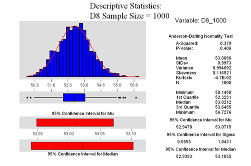 From the two graphs
at the right, we see that both are Normally Distributed. Further,
we see that the 95% confidence interval for the mean for the D8
sample is between 52.9478 and 53.0715. Quite a narrow range. For
the D12 sample, we see that it is between 54.9338 and 55.0593.
From the two graphs
at the right, we see that both are Normally Distributed. Further,
we see that the 95% confidence interval for the mean for the D8
sample is between 52.9478 and 53.0715. Quite a narrow range. For
the D12 sample, we see that it is between 54.9338 and 55.0593.
Of course, statistically, we are interested
if those two means are different enough to say with confidence
that they are indeed different. To prove that, first we have to
do what is called an F test which tests for equal variance in
the sample. I ran it for all the samples, and it said that the
variances in the two samples were equal. I won't go into the test,
just trust me when I tell you they are. This assumption is important
to do the next test, a 2 sample T test.
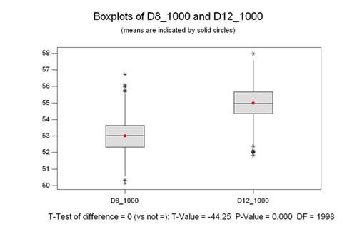
2 Sample T Test
Just this one last test, and we can look
at some graphs for different sample sizes which will illustrate
my point. There is a point to this, just hang in there a little
longer.
At the right we are comparing the two populations
above. This type of graph is called a box plot. The box represents
50% of the population, and the whiskers show the upper and lower
25% of the population. The asterisks are outliers, that is data
which is outside the expected normal distribution. The line in
the box is the median for the population. The median is the middle
value, meaning that there are as many values above it as below
it. It is different than the mean, or the average. The mean is
the red dot.
Ok, on to the T test. The whole point of
the T test is to prove if the means are different or not. The
bottom line of the graph shows that the P value is 0.000. That
means that we have to reject the null hypothesis and accept the
alternate hypothesis. Put another way, there is 0% chance of being
wrong is you say the means are different. I'm sure you are saying,
"Duh, no kidding, any fool can see that". True, but
stick with me, it's about to get interesting.
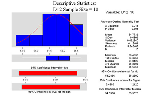
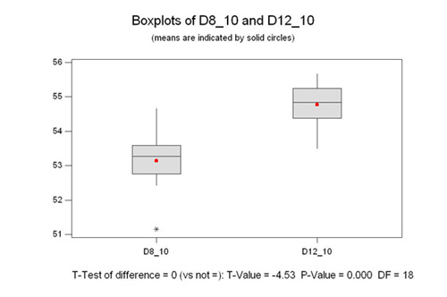
Sample Size of 10
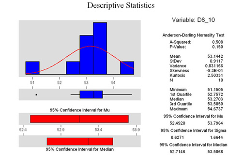 At the right are the same three graphs, only using
a sample size of 10. As we can see from the P values all the data
is normally distributed, although the D12 sample is a lot more
normal than the D8 sample. Both are within the parameters of the
test however.
At the right are the same three graphs, only using
a sample size of 10. As we can see from the P values all the data
is normally distributed, although the D12 sample is a lot more
normal than the D8 sample. Both are within the parameters of the
test however.
I would like to draw your attention to the
confidence interval of the mean for each graph. Notice how it
has widened out when we only look at 10 samples.
Look at the 2 sample T test, we see however,
that there is still a 0% chance of being wrong if we say that
the means are different.
OK, I'm sure you are saying , so what...where
is this going. One last example.
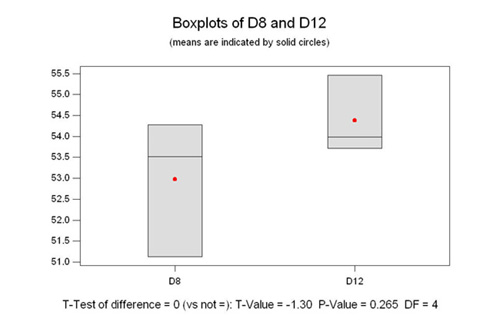
Sample Size of 3
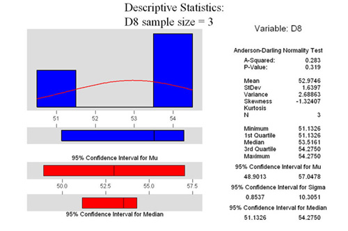 OK, look at the three graphs at the right. Remember,
they were randomly generated using the same parameters as above.
I just told the computer to only make three samples instead of
10 or 1000. Notice that both are normal (from P>.05). But look
at the 95% confidence interval of the mean. From roughly 50 to
57 for the D8, and from 52 to 56.7 for the D12. Remember that
means that we are 95% confident that the true mean is somewhere
in that range. Notice how they are almost the same range?
OK, look at the three graphs at the right. Remember,
they were randomly generated using the same parameters as above.
I just told the computer to only make three samples instead of
10 or 1000. Notice that both are normal (from P>.05). But look
at the 95% confidence interval of the mean. From roughly 50 to
57 for the D8, and from 52 to 56.7 for the D12. Remember that
means that we are 95% confident that the true mean is somewhere
in that range. Notice how they are almost the same range?
Looking at the 2 sample T analysis, we see
that the P value is .265. That means that if we say that the means
are different, we run a 27% risk of being wrong. Therefore, in
this case we have to accept the null hypothesis which says that
they are in fact statistically the same.
Ta Da! There is the punch line. I couldn't
run the test for a sample size of less than 3, but, you get the
idea. Further, look at the boxplot in the 2 sample T test. See
how they overlap? This is the most important point in this long
essay.
When you have a small sample size, you can't tell
with any confidence if you picked a sample that is truly representative
of entire population, or you picked one that was way out on the
edge of the bell shaped curve. The closer two populations are
together, the more their distributions overlap. To tell the difference
you need a very large sample size. Thousands or tens of thousands.
Conversely, if the means of two populations are very far apart,
you can have a very small sample size and still be able to distinguish
between the two.
What this means with
respect to Eric's Study
Well, if you suffered through all that without
nodding off, you must be really interested in this stuff, so I
owe it to you to tie it all together. As I've just demonstrated,
you can't possibly sample just one saw out of a population of
millions and draw any conclusion from it. To do a proper study
that you could believe in, you would have to do the following.
Find a sample of at least 30 saws of each type, and have each
type be in the same age range as the others. For instance, you
would not want to test a 1950s vintage D23, and an 1890 vintage
#7. You would want to test all the saws from the same age range.
What you are trying to do is take all the variation out of the
sample that you can, so other variables can't influence your test.
30 is a good sample size to use for any study like this as it
is a good compromise. Ideally we would want to test them all to
get the real mean (X bar as it is known), instead of Mu, which
is the mean of a representative sample.
I used hardness in this example because
the numbers were easy to work with. The exact same theory applies
to any of the other things measured...nickel or carbon content,
etc. In fact, in Eric's test, he comments how the back saw is
much harder than most, as evidenced by the fragile teeth. This
saw is very far away from the real mean of hardness....out at
the thin edge of the bell shaped curve (maybe even six standard
deviations away). If you only tested this saw, and didn't know
anything about steel or hardness, you might conclude that all
back saws were this hard. We know that isn't the case. This
one example points out the severe flaw in this study.
I realize that I don't know what Disston
intended for the actual hardness of a D8 and a D12. I also don't
know if the standard deviation is 1, 2 or maybe .5. This is important
as it affects how far apart the populations have to be to tell
the difference between them. A standard deviation of 2 has a curve
that is much wider than the same curve with a standard deviation
of one. For the sake of the example, I kept the Standard Deviation
the same. I am willing to bet that populations are normally distributed.
If they aren't, we could use other tests on the median which would
tell us the same thing.
In summary, I hope that no one thinks that
I am throwing stones at the effort that Eric put out to do what
he did. Having said that, you just can't draw any conclusion from
his efforts except that for the 5 saws he tested, the results
are as he posted them on his site. You simply can't extrapolate
what you see for one saw and say that it is the same as all saws
of that particular type. It just doesn't work.
Yours in Statistical Analysis,
Pete
Taran, Six Sigma Black Belt in training
(who also knows a lot about saws)
[Home]